
The Role of Color Psychology in Modern Home Aesthetics
Understanding the integral part color psychology plays in shaping the ambiance and functionality of our living spaces is crucial in modern home aesthetics. Colors have a profound impact on emotions, behavior, and even physiological responses, making them a powerful tool in interior design. By thoughtfully selecting color palettes, homeowners and designers can evoke specific moods, increase productivity, encourage relaxation, and reflect individual personalities. The interplay of color within a home’s aesthetic goes far beyond mere decoration—it is a subtle yet significant language that communicates comfort, style, and wellbeing.
The Psychology of Color in Interior Design
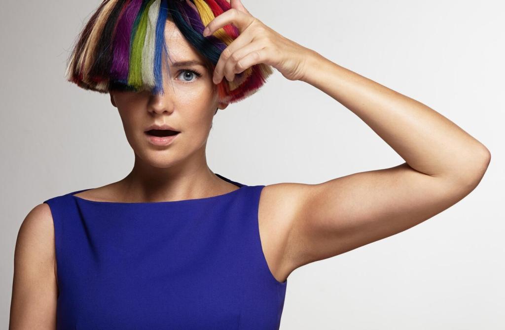
Colors affect our mood and emotions in distinct ways, often at a subconscious level. Warm colors such as reds and oranges can evoke feelings of energy and warmth, making them ideal for social areas like living rooms and dining spaces. Conversely, cool tones like blues and greens are associated with calmness and tranquility, which makes them suited to bedrooms and bathrooms. A well-designed color scheme can bring a sense of harmony and comfort, while clashing or excessive use of intense colors might cause unease or restlessness.
The use of color plays an instrumental role in how we perceive the size and lighting of a room. Lighter colors tend to reflect more light, creating the illusion of a larger and more open space, while darker shades can make rooms feel cozier or even smaller. Designers expertly employ these tricks to manipulate spatial perception, compensating for architectural limitations. By balancing light and dark hues, one can control both the aesthetic and practical aspects of a room’s atmosphere.
Cultural background and personal experience influence how individuals respond to colors in their homes. For example, some cultures associate white with purity and cleanliness, while others connect it with mourning. Personal preferences, memories, and associations also come into play, meaning that “perfect” colors vary from person to person. A successful design will consider these factors, ensuring that chosen palettes resonate with the inhabitants on both a cultural and individual level.
Contemporary Color Palettes
Modern homes often feature palettes inspired by both nature and innovation. Earthy tones, muted greens, and calming blues have remained popular for their ability to create tranquil spaces. At the same time, accent colors like mustard yellow, terracotta, or deep teal add vibrancy and modernity. These trends are often synonyms for emotional expression, creating atmospheres where technology and comfort seamlessly blend.
The Influence of Minimalism
Minimalism has greatly shaped modern home aesthetics, and its approach to color is deliberate and restrained. This design philosophy leans heavily on neutral palettes, favoring shades of white, gray, beige, and soft pastels. These colors serve as a calm backdrop, promoting clarity, focus, and a sense of peace. They also allow for flexible styling and easy adaptation to trends or personal touches, without overwhelming the senses or the space itself.
Previous slide
Next slide