
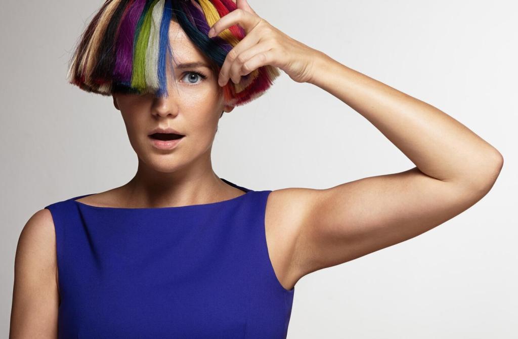
The Influence of Color Psychology on Interior Design
Color psychology plays a pivotal role in shaping the ambiance, functionality, and emotional resonance of interior spaces. By understanding how different hues influence emotions and behaviors, designers can craft environments that promote comfort, productivity, or relaxation. The thoughtful application of color transforms interiors from mere functional settings into immersive experiences that reflect personality, support well-being, and foster meaningful interactions.
The Biological Basis of Color Response
Human responses to color are partly hardwired through biology. Certain hues can activate physiological responses such as increased heart rate or enhanced alertness. For instance, warmer tones may spur energy and excitement, while cooler hues can have a calming effect. These biological tendencies are crucial for interior designers to acknowledge, as improper color selection can inadvertently create stress or lethargy instead of the intended ambiance for a space.
Cultural Influences on Color Meaning
Culture dramatically shapes our expectations and associations with different colors. While white is linked to purity in Western societies, it represents mourning in some Eastern cultures. Interior designers must be sensitive to these cultural connotations, especially in multicultural settings or spaces designed for international audiences. Awareness of these subtleties ensures that color choices resonate positively, avoid misunderstandings, and foster inclusivity within interior environments.
Emotional Impacts of Color in Interiors
Colors provoke emotional reactions that influence our experience of a space. Blue can instill a sense of calm and trust, ideal for bedrooms or offices, while bold reds might evoke excitement and energy, suitable for social areas. By leveraging these emotional effects, designers can create interiors that support the intended mood, such as tranquility, warmth, or vibrancy, enhancing the psychological comfort and satisfaction of occupants.
Warm Colors: Energizing and Inviting Interiors
Red is associated with excitement, strength, and passion. When used in moderation, it can add warmth and energy, making it ideal for spaces intended for socializing such as dining rooms or living areas. Excessive red, however, may lead to feelings of agitation or restlessness, so it is often balanced with neutral tones to maintain harmony and comfort in interiors.
Previous
Next
Cool Colors: Calming and Expansive Effects
Blue: The Tranquility of Trust
Blue embodies calmness, stability, and reliability, often associated with the sky and sea. Designers frequently use blue in bedrooms or offices to foster concentration and restful sleep or facilitate clear thinking. However, too much blue or poorly chosen shades can result in a cold or uninviting space, so designers often pair blue with warmer accents or textures to prevent such effects.
Green: Harmonizing with Nature
Green represents balance, renewal, and harmony, drawing inspiration from the natural world. Its restorative quality makes it a popular choice for living rooms, bedrooms, and areas meant for rejuvenation. Designers utilize various greens, from vivid emeralds to muted sages, to create interiors that feel refreshing and serene, encouraging relaxation and a sense of well-being.
Purple: Creative Sophistication
Purple, historically associated with luxury and creativity, combines the calm of blue and the energy of red. Its versatility allows it to add sophistication to bedrooms or creativity to studio spaces. Lighter shades such as lavender provide tranquility, while richer violets add a bold accent. Designers leverage purple’s psychological depth to inspire imagination without overwhelming a room’s atmosphere.
Neutral Colors: Flexibility and Timelessness
White: The Canvas of Possibility
White symbolizes cleanliness, simplicity, and openness. In interior design, it enlarges the perception of space and reflects natural light, making any room brighter and airier. Designers often use white as a backdrop for bold accent colors or striking textures, ensuring that spaces remain timeless and easily customizable through changes in decor or accessories.
Gray: Modernity without Monotony
Gray has gained immense popularity for its ability to convey sophistication and balance. Available in warm or cool undertones, it adapts well to modern, minimalist, or traditional styles. Instead of feeling dull, thoughtfully layered grays can create dynamic and comfortable interiors that maintain a sense of calm neutrality, complementing vivid accents or natural materials effortlessly.
The Power of Accent Colors
Creating Visual Focal Points
By applying distinctive accent colors to specific walls, furnishings, or decor items, designers can establish prominent focal points within a room. These elements draw attention and add interest, making the space more memorable and supportive of its intended function. The careful choice and placement of accent hues ensure they complement, rather than clash with, the primary color palette.
Expressing Personality and Mood
Accent colors provide an opportunity for individuality and self-expression within interior design. Homeowners or occupants can introduce their favorite colors in measured doses, reflecting personal style or reinforcing the emotional tone they wish to achieve. Whether through pillows, artwork, or small accessories, accent colors enliven neutral schemes and make a space uniquely personal.
Adapting to Changing Trends
Because accent colors can be incorporated through elements like textiles, artwork, or small furnishings, they offer flexibility to adapt to evolving design trends. Replacing an accent piece is significantly easier and more cost-effective than repainting walls or refurnishing entire rooms. This adaptability helps interiors feel current and fresh without extensive renovation.
Lighting and Its Interaction with Color
Natural daylight changes in tone and intensity throughout the day, causing colors to look different in morning, afternoon, and evening. North-facing rooms may require warmer hues to counter bluish light, while sunlight enhances the richness of bold colors. Designers account for window placement and sun exposure to select color schemes that remain visually appealing and emotionally appropriate at all times.
Energizing Social and Collaborative Areas
Vibrant colors are often reserved for spaces where activity and interaction are encouraged, such as dining areas, lounges, or meeting rooms. These zones benefit from hues that stimulate communication and engagement, making them feel alive and welcoming. Designers harness this effect by choosing palettes that energize but do not distract, ensuring spaces are suitable for lively gatherings or collaborative work.
Retreats for Relaxation and Recovery
For spaces dedicated to relaxation, introspection, or healing, softer and cooler colors prevail. Bedrooms, meditation rooms, or wellness spas are often swathed in blues, greens, or gentle neutrals to cultivate tranquility and comfort. Through careful selection, designers can foster an atmosphere that supports rest, stress relief, or mindfulness, underpinning the space’s restorative purpose.